How Predictive are the GV Ratings?
There have been 33 games reported that were played after 10/24/2015. Based on earlier ratings computed for games up to that date, we correctly predicted the winner of 97.0% of those recent games (32 of 33).
For those 33 games, there was on average a 0 goal difference between the actual winning margin and the predicted winning margin.
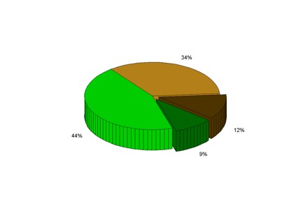
The piechart below shows a breakdown of the success rate in predicting game results, from the perspective of the home team. The fraction of games in which the home team won as predicted is shown in green. The fraction of home games that were lost as predicted is shown in light brown. The fraction of home wins that had been predicted as losses is shown in dark green, and the fraction of home losses that had been predicted to be wins is shown in dark brown.
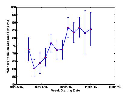
The plot below shows the success rate for predicting game winners for games each week during the season. Error bars are calculated based on the number of games played that week. When few games are played, it takes only a few games going against the statistical expectation for the success rate to change by a relatively large amount. The fewest games played were the first week of the season.
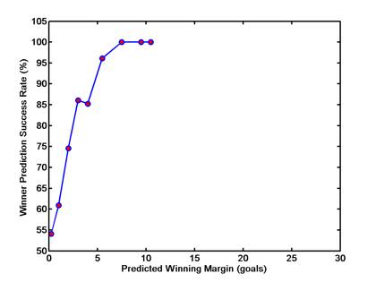
The plot below shows the success rate for predicting game winners depending on how close the winning margin that was predicted by the strength ratings. The success rate for games that were predicted as wins by 0-0.5 goals is shown at the far left, followed by games where the winning margin was predicted to be 1, 2, 3, 4, ... goals, etc. We rarely miss predicting the winner when the winning margin is expected to be 3 goals or more.